Bringing Sports Psychology to Every Athlete
Jun ‘24 - Present
Design
Product Strategy
Legacy
Mindset Matters
Elite athletes know that physical preparation is only half the battle—mental preparation is just as critical. As Michael Jordan once said:
"The game is 80% mental and 20% physical"
Yet, for many athletes, access to sports psychology remains out of reach due to high costs. Ebb is on a mission to change that by offering accessible sports psychology, helping every athlete think, feel, and perform at their best.
A video of the original prototype the team had created before I joined
The Challenge
When I joined Ebb, the team had a basic prototype that validated the demand for sports psychology content via an app. However, the team had no design experience and needed a structured approach to turn this concept into a fully functional, commercially viable product.
Athletes face a critical challenge: consistent access to sports psychology is often expensive, making it inaccessible for those outside the top tiers of their sport. The goal was to bridge this gap by delivering tailored sports psychology content that meets each athlete where they are in their journey.
My Process
Understand — I immersed myself in the project by running a discovery workshop with the CEO to gather insights and align on key objectives.
Prioritise — I led a prioritisation session to narrow the MVP’s scope, rallying the team around the principle of depth over breadth to focus on delivering a personalised experience before adding more features.
Ideate — I brainstormed solutions, wireframed the app, and collected feedback to refine the experience, ensuring it met athlete needs.
Refine — I created high-fidelity designs and iterated them based on feedback, producing a seamless flow for athletes using the app.
Test — Usability tests were conducted with athletes to ensure the app was intuitive and engaging.
Handoff — I introduced Linear to manage the design-to-engineering handoff and organised storymapping sessions to ensure a smooth transition from design to development.
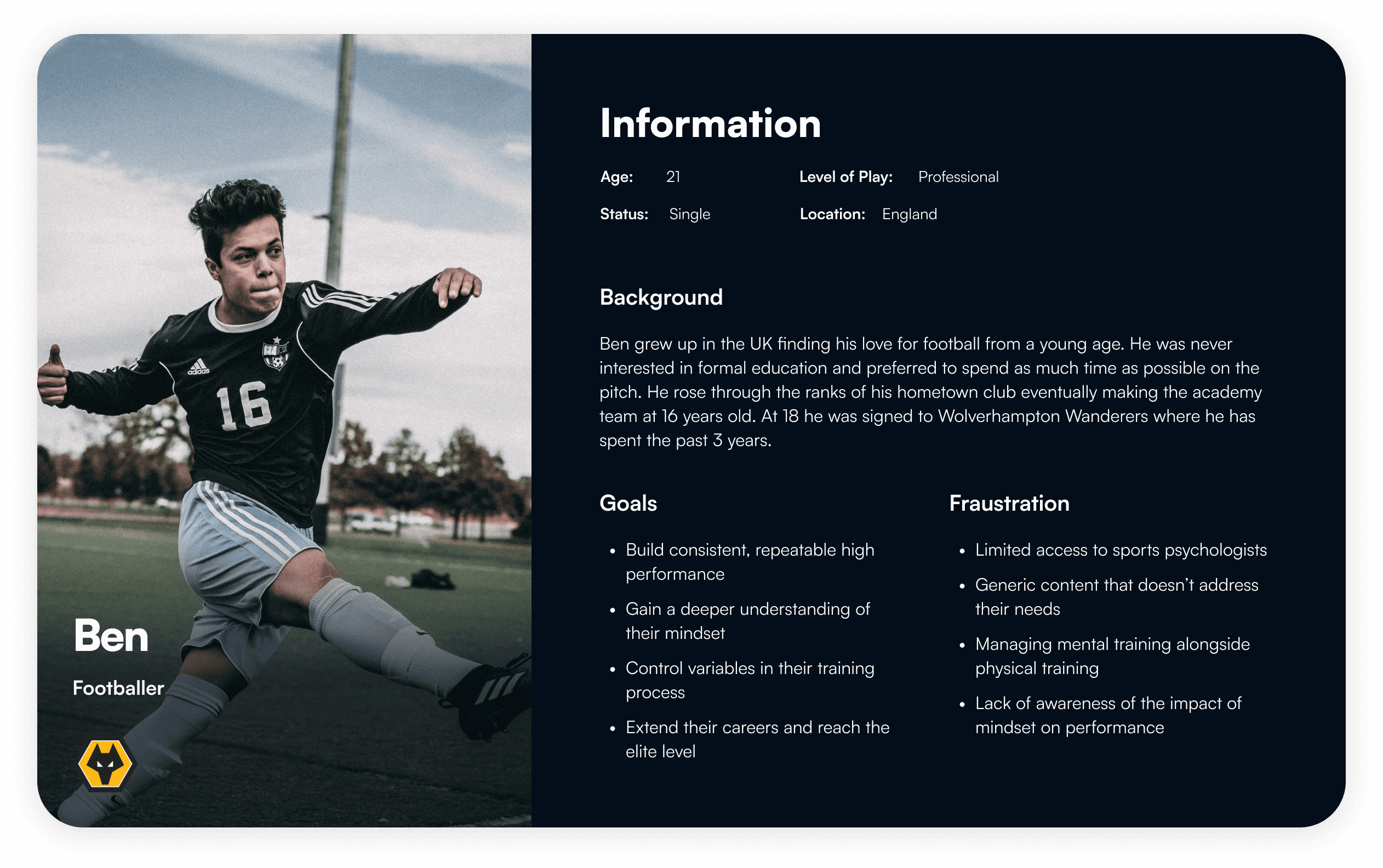
Persona of a typical athlete that Ebb is targetting
Understanding the Athlete
To quickly understand the athlete’s goals and challenges, I relied on the team’s knowledge, particularly insights from the CEO and a former Premier League footballer.
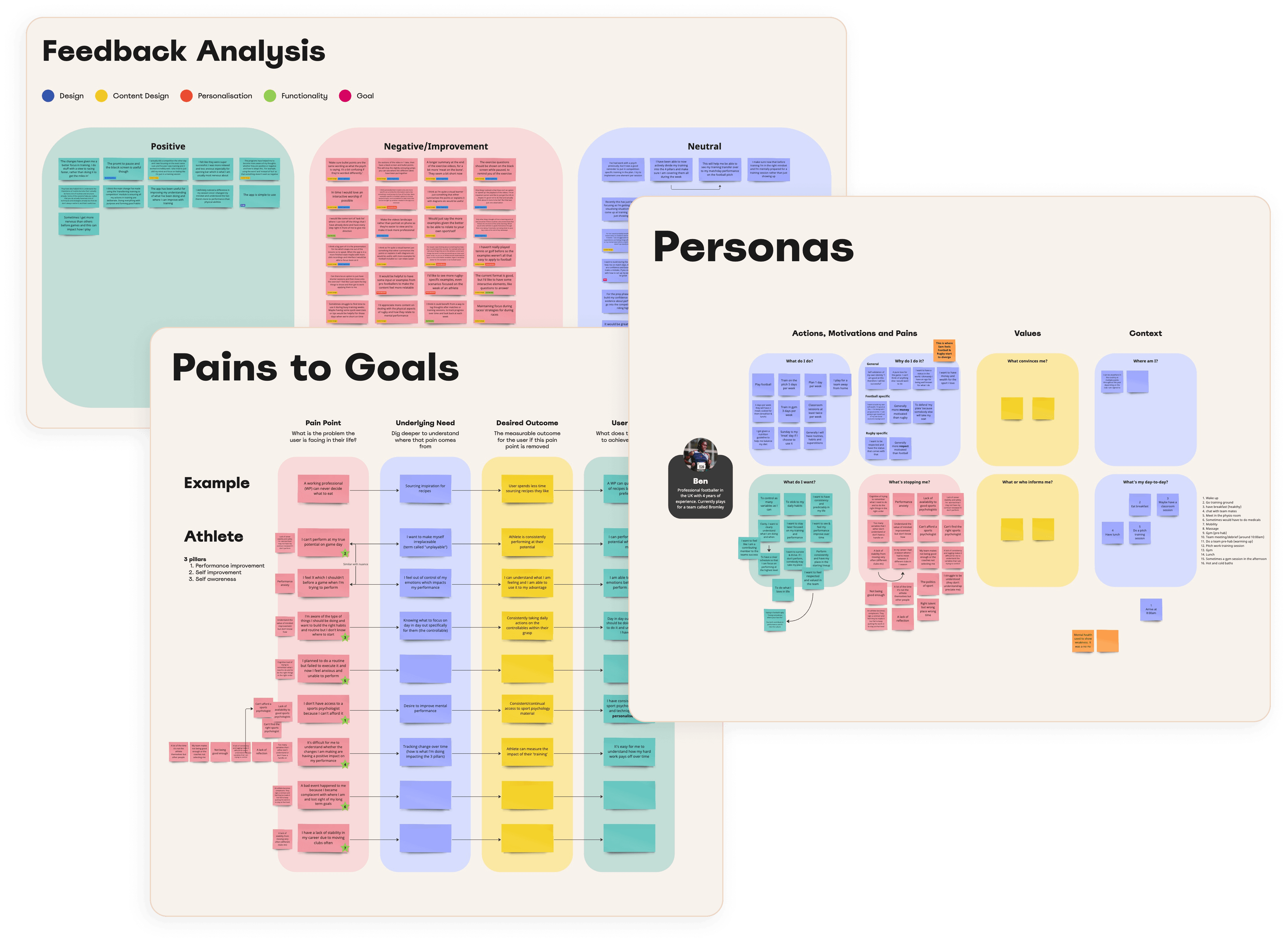
Visuals from a workshop run to define the athlete persona & map their goals to pains
Once we had a clear understanding of the typical athlete persona, we delved deeper into their challenges to map out key pain points and how they related to their goals. Through this process, we identified nine core pain points. To maintain focus, we prioritised these based on the severity of the pain and how closely they aligned with the company’s mission.
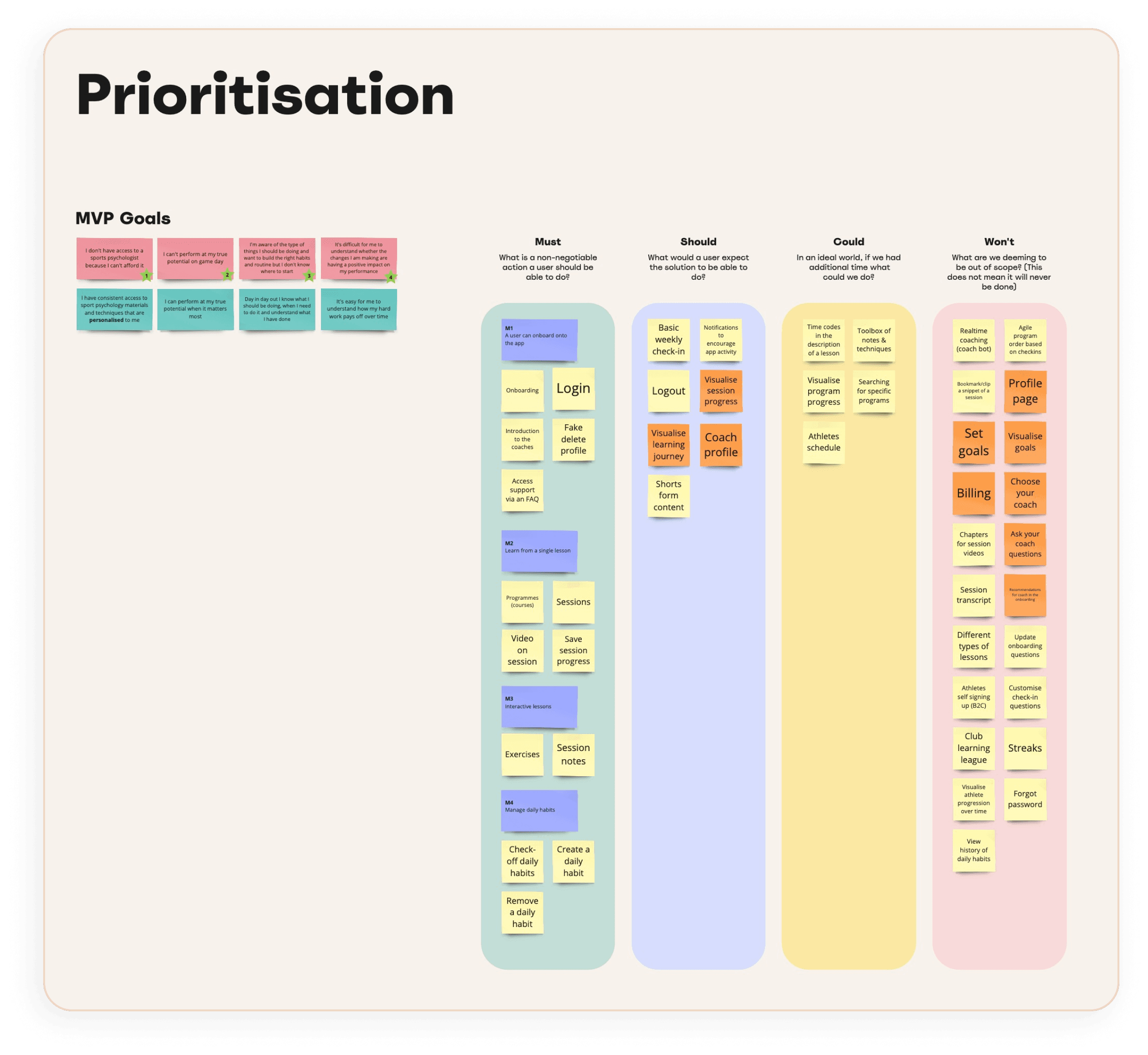
Visuals from a workshop to prioritise the MVP features based on the prioritised user goals
Reducing Feature Bloat
Feedback from athletes during the prototype stage showed three critical insights:
Personalised content was essential.
The format of content delivery mattered.
Even in its early form, the content had been helpful.
However, I noticed that non-essential features, such as athlete schedules, were creeping into the MVP. To address this, I led an in-person workshop to align the team on the core problem we were solving: providing personalised sports psychology content. We cut 60% of the features and rallied around delivering an excellent content experience first.
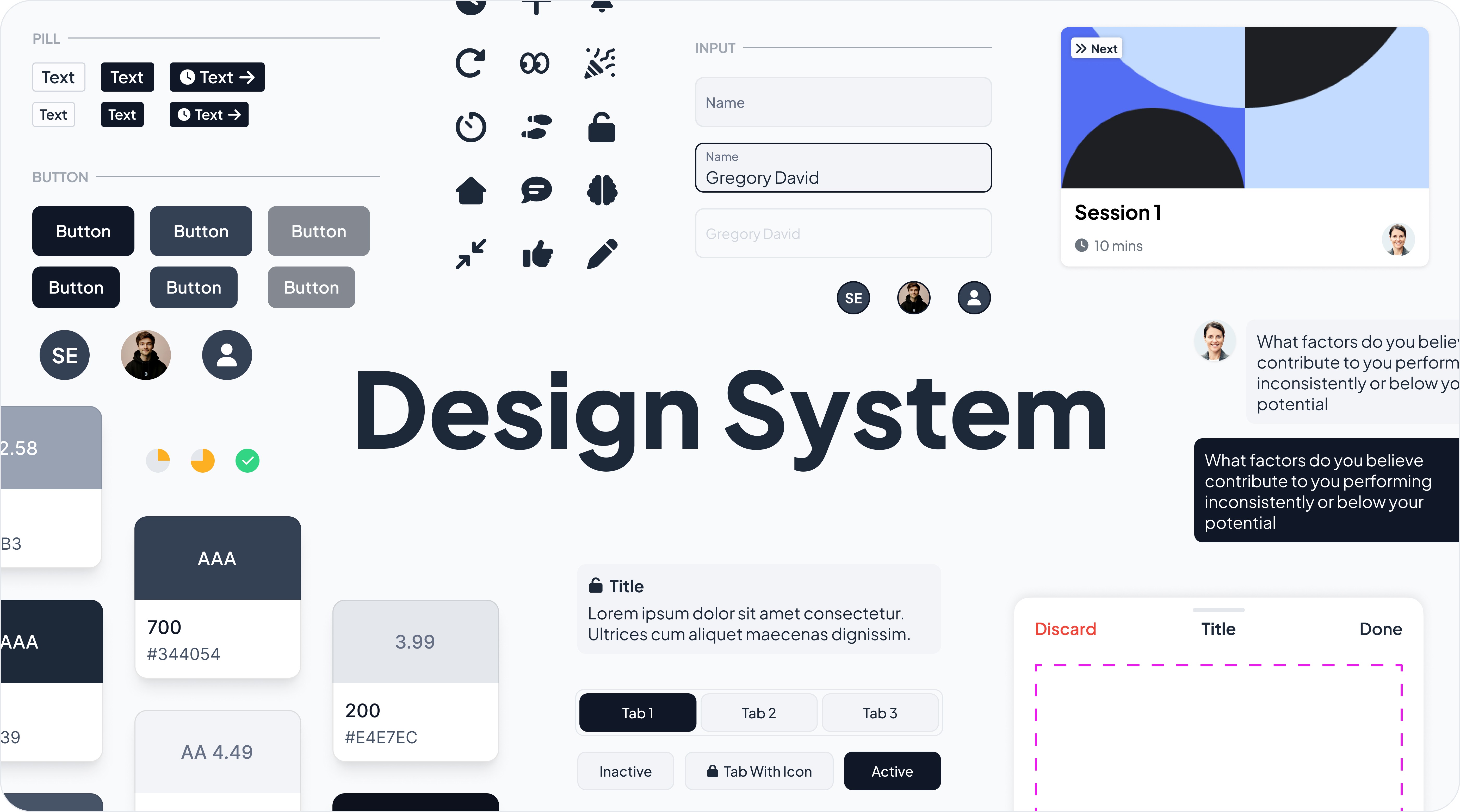
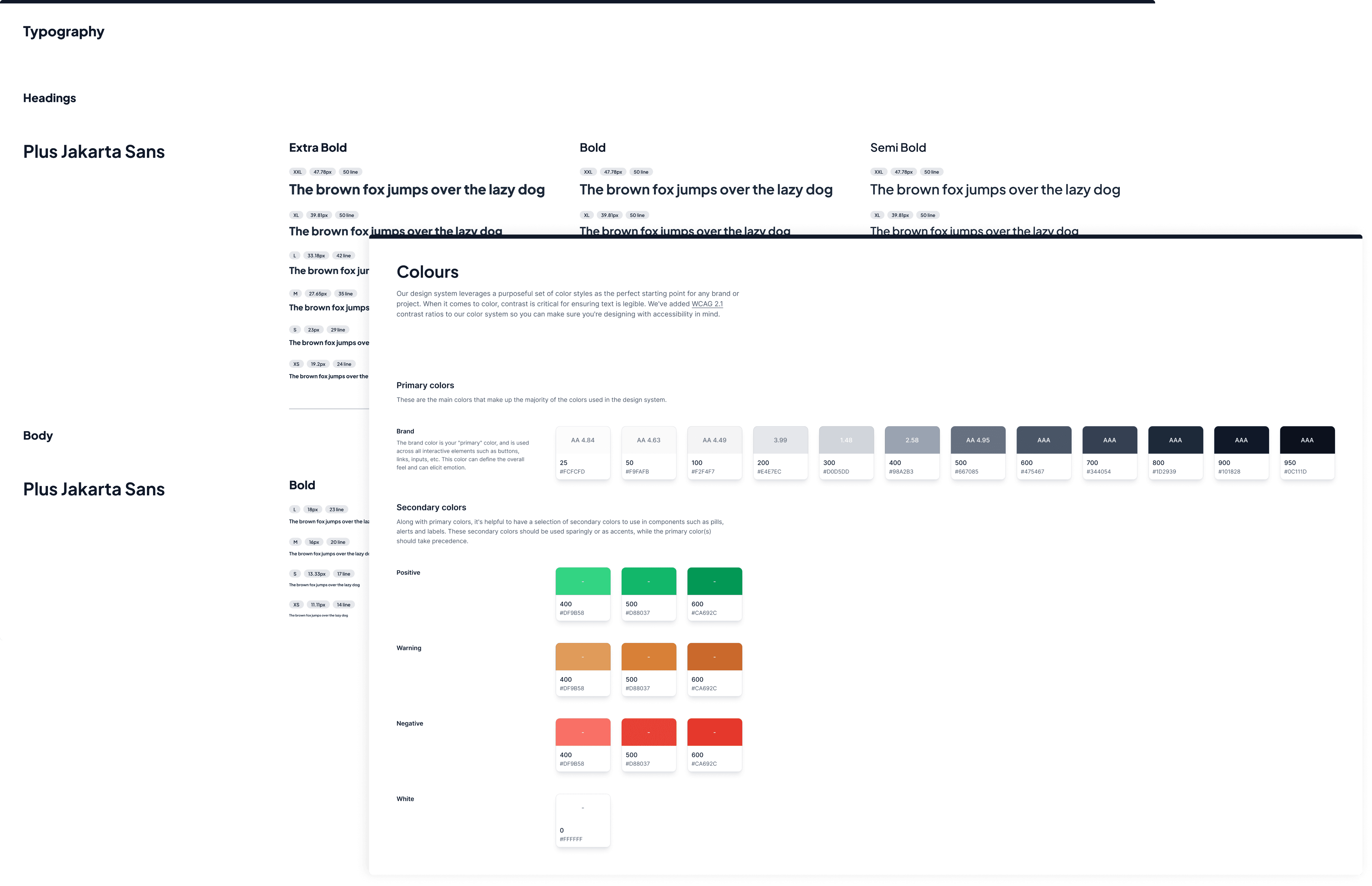
Snapshot of the design system that I established
Establishing the Design System
Given the limited time available, I took a lean approach to the design system. Instead of designing everything upfront, I only added components as they became necessary for multiple screens. This kept the system agile and focused.
During this process, I established Ebb’s brand identity, including typography, colours, and logos, ensuring consistency across the app.
A basic logo crafted for the launch of ebb
Colour and typography slides from the design system
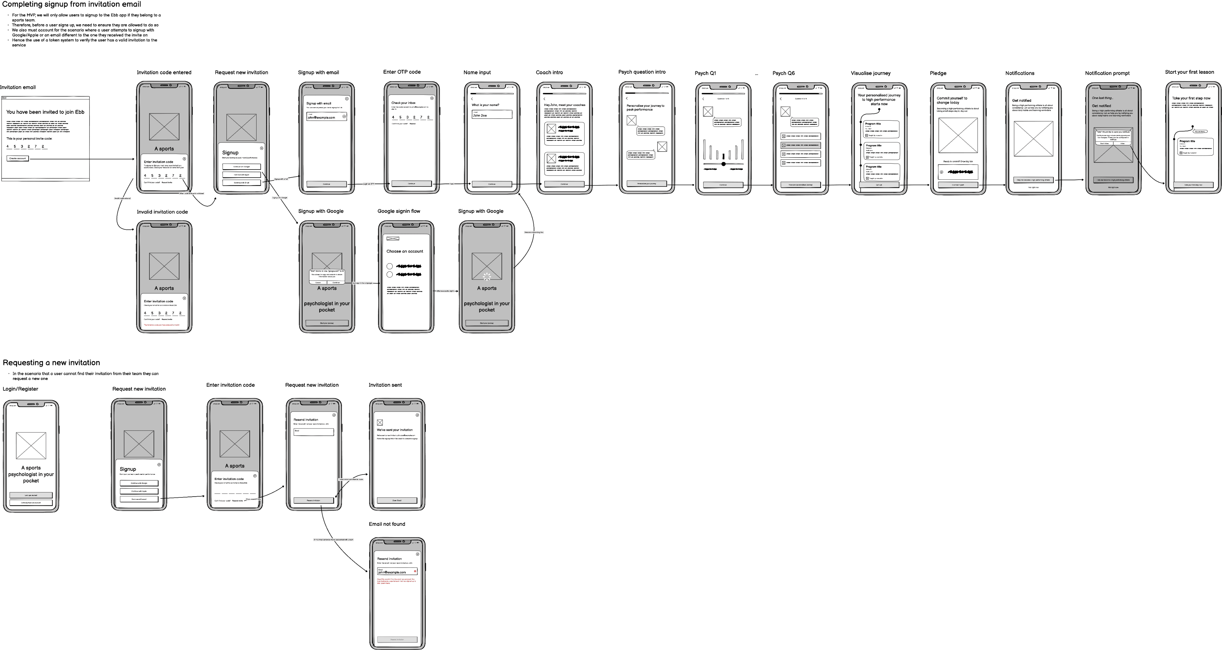
Wireframes of the initial register and onboarding flow
Onboarding & Personalisation
The onboarding experience was one of the most challenging parts of the project. Traditional athlete assessments, such as long questionnaires, were impractical. I needed a streamlined flow that wouldn’t overwhelm athletes but still gathered enough data for personalisation.
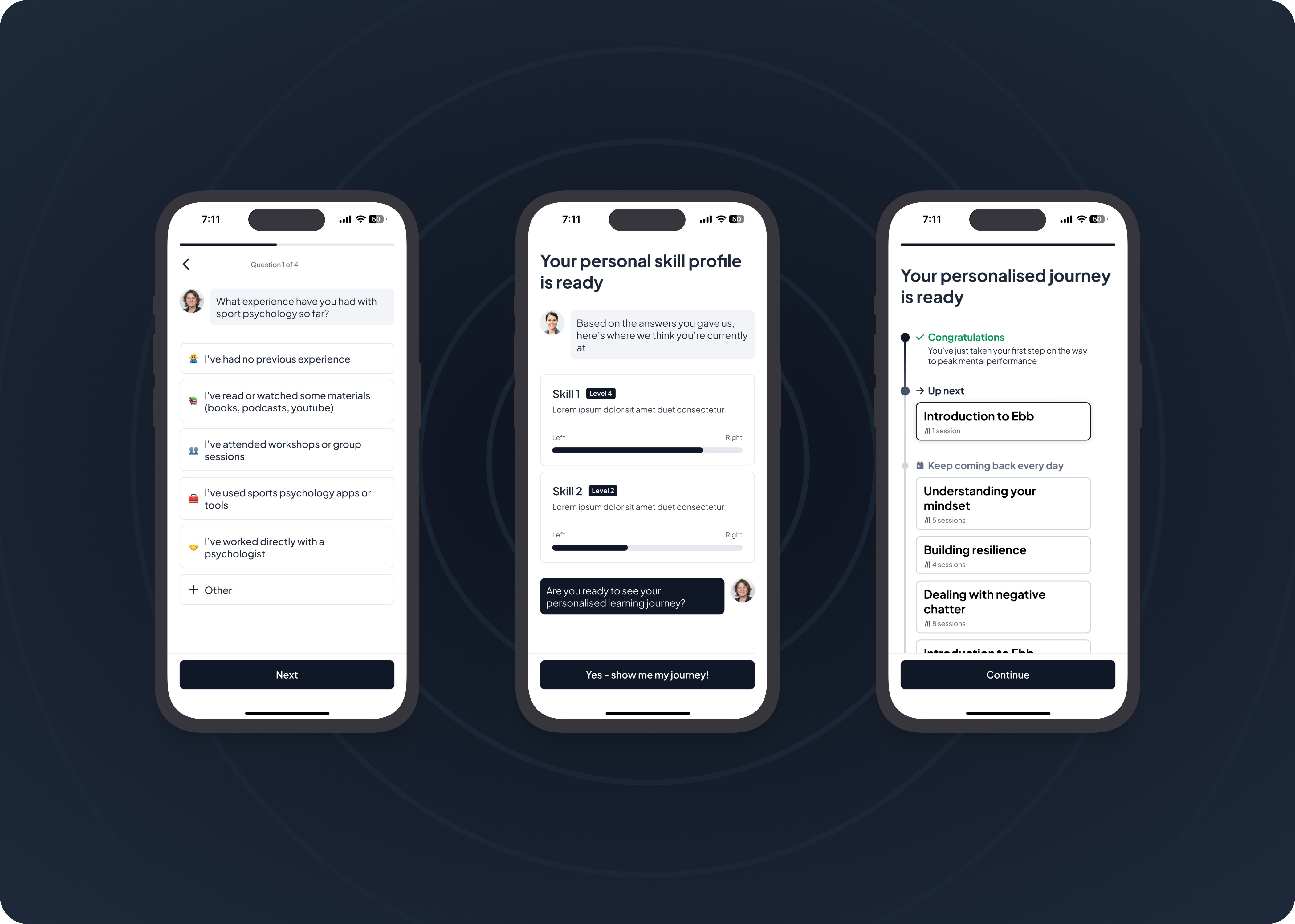
Through a workshop with the CEO and sports psychologists, we developed a skill profile model to assess athletes across mental skills. This profile mapped to specific programmes, enabling us to create a personalised journey for each athlete.
I also introduced an ‘aha moment’ in the onboarding flow, where athletes received a breakdown of their skill profile, which validated their strengths and motivated them to improve their weaknesses.
Example of an onboarding question (left), the skill profile that an athlete is shown (centre) and the journey created for an athlete (right)
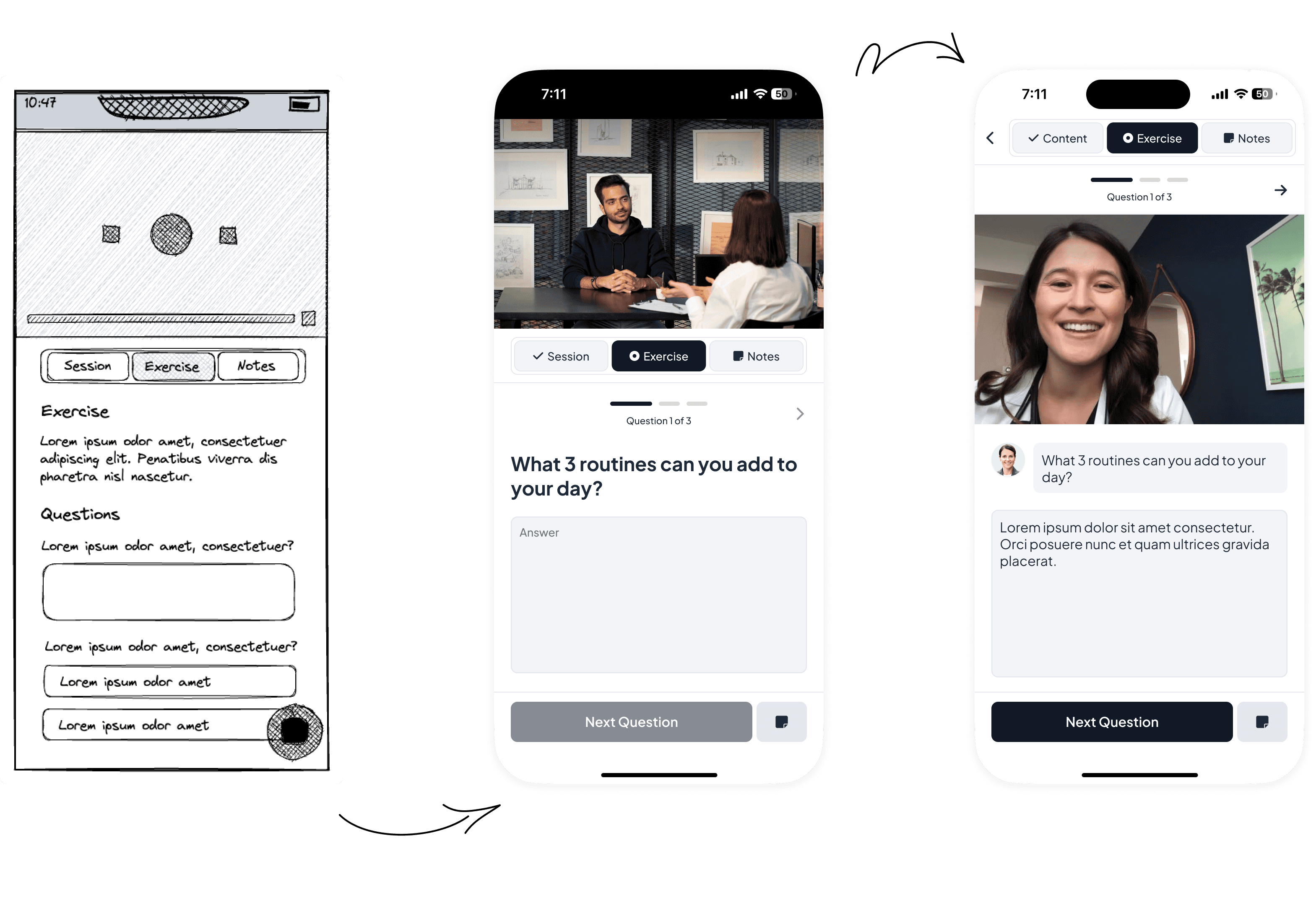
The evolution of the sessions concept from wireframe (left) to V1 (centre) and final (right)
Session Experience
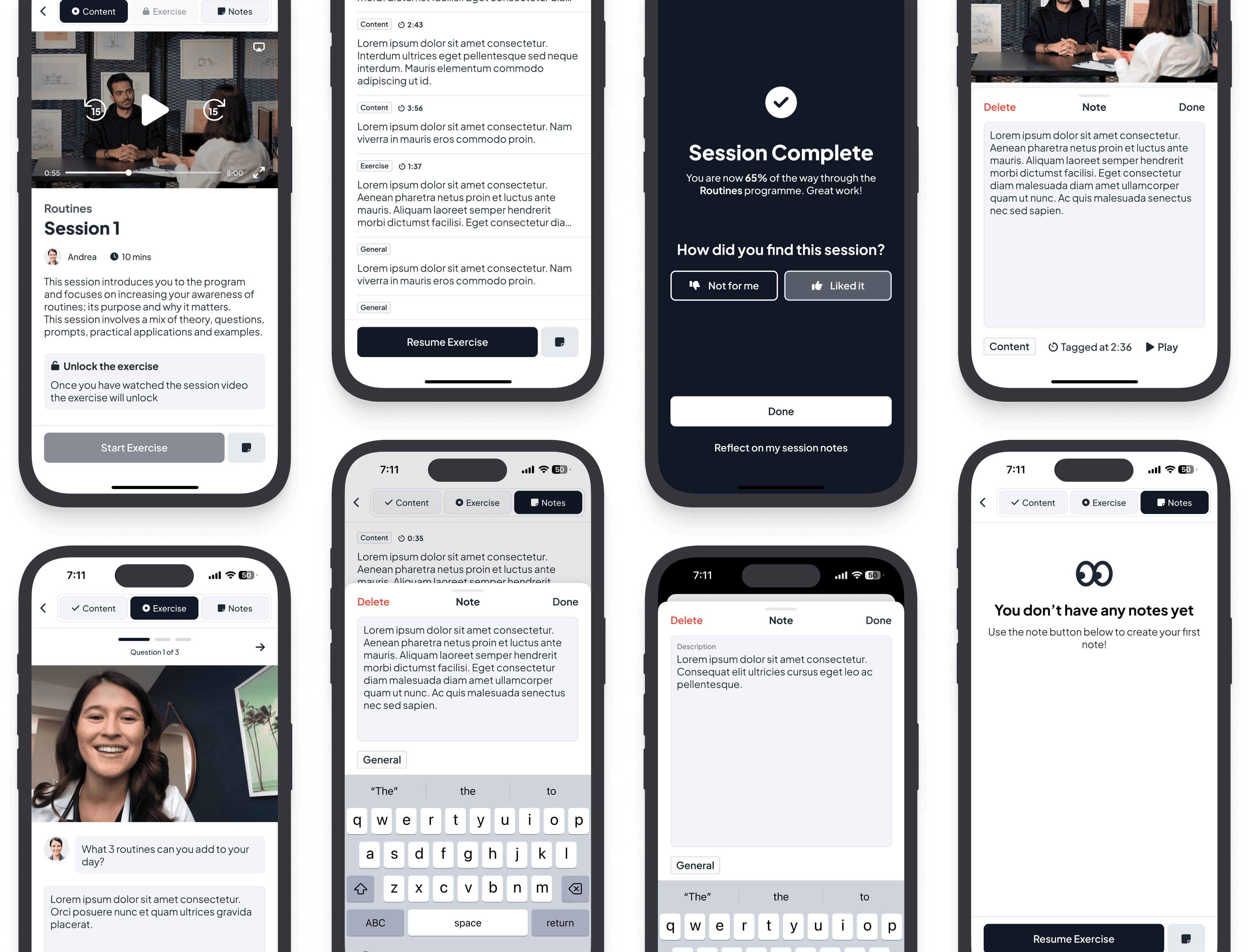
The original prototype relied on handwritten notes, which was inconvenient for athletes. My design brought the core elements—content, exercises, and notes—into one seamless interface.
A session in the app consists of:
Content – A video session led by a sports psychologist.
Exercise – Questions to reflect on the session.
Notes – Accessible across all tabs, allowing athletes to capture insights at any point.
This redesign made the app more practical for athletes, who appreciated the convenience of not needing to take handwritten notes. One challenge was the discoverability of the note button, which we resolved by placing it in the action bar.
A collection of visuals showing the core session experience
Daily Habits
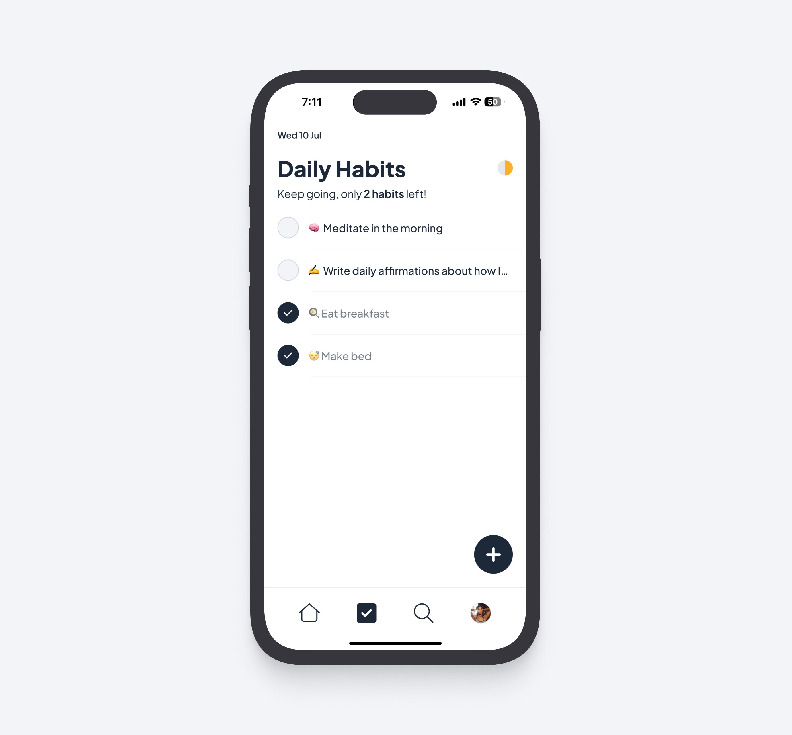
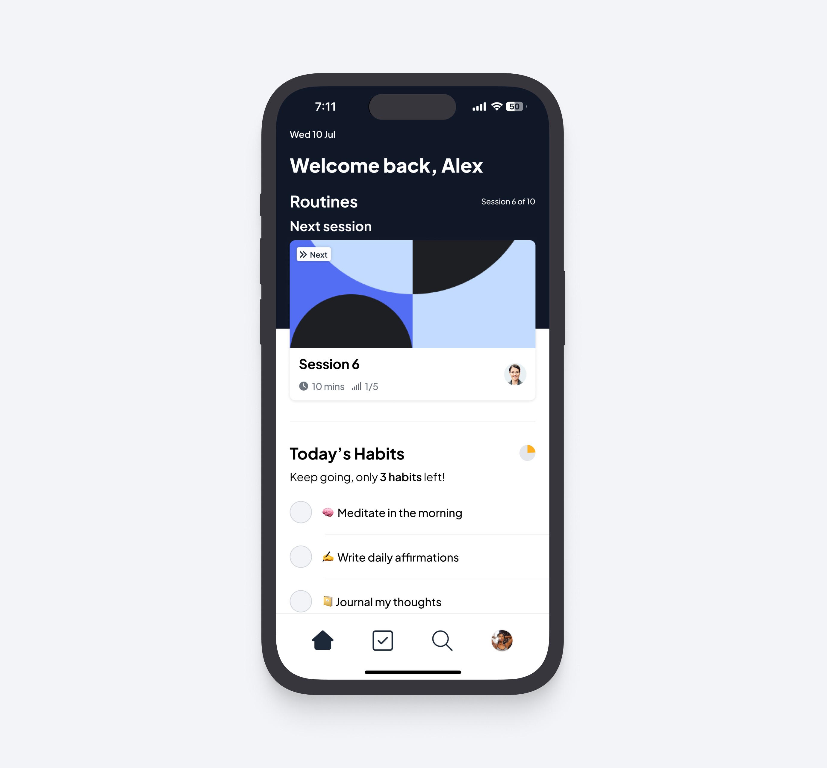
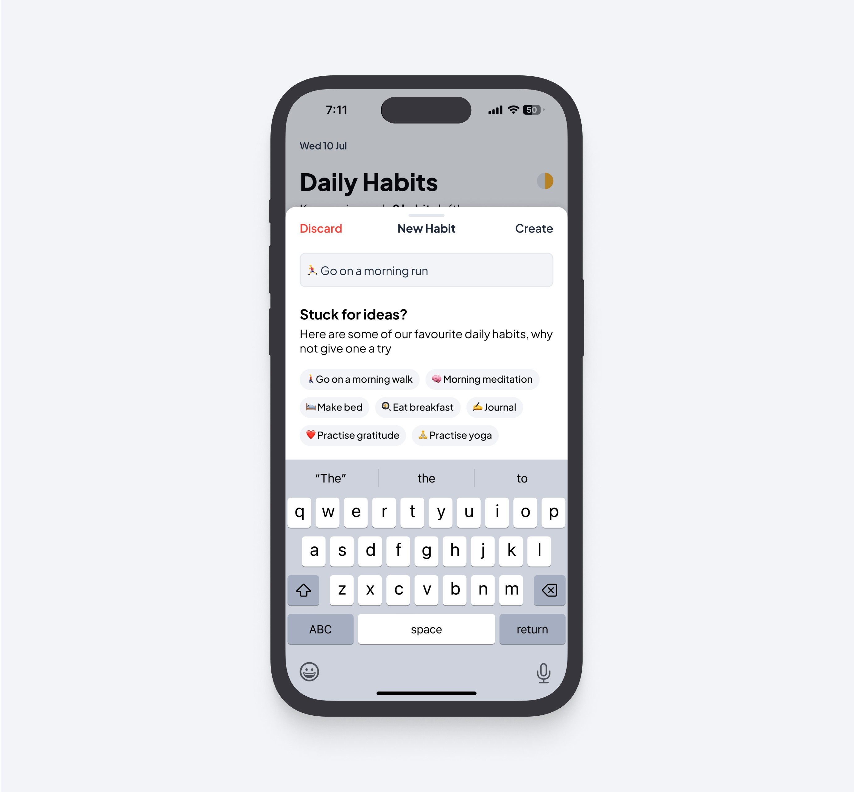
One of the key features we included in the app was Daily Habits, designed to drive behavioural change by encouraging athletes to develop consistent routines. At the core of high performance are the habits we practice day in, day out, and this feature helps athletes integrate those habits into their daily lives.
The video content delivered through the app offers suggestions for habits that athletes can adopt to enhance their performance. Our hypothesis was that by engaging athletes in daily habits, they would be more likely to return to the app regularly, and as a result, consume content more consistently—moving us closer to our north star metric.
Since this feature complemented the core focus of the app (engaging content delivery), I kept the design simple. The Daily Habits feature can be accessed in two key areas:
Homepage – keeping it front and centre in the athlete’s journey
Daily Habits Home – a dedicated Daily Habits page, where athletes can manage their habits, such as creating or deleting them
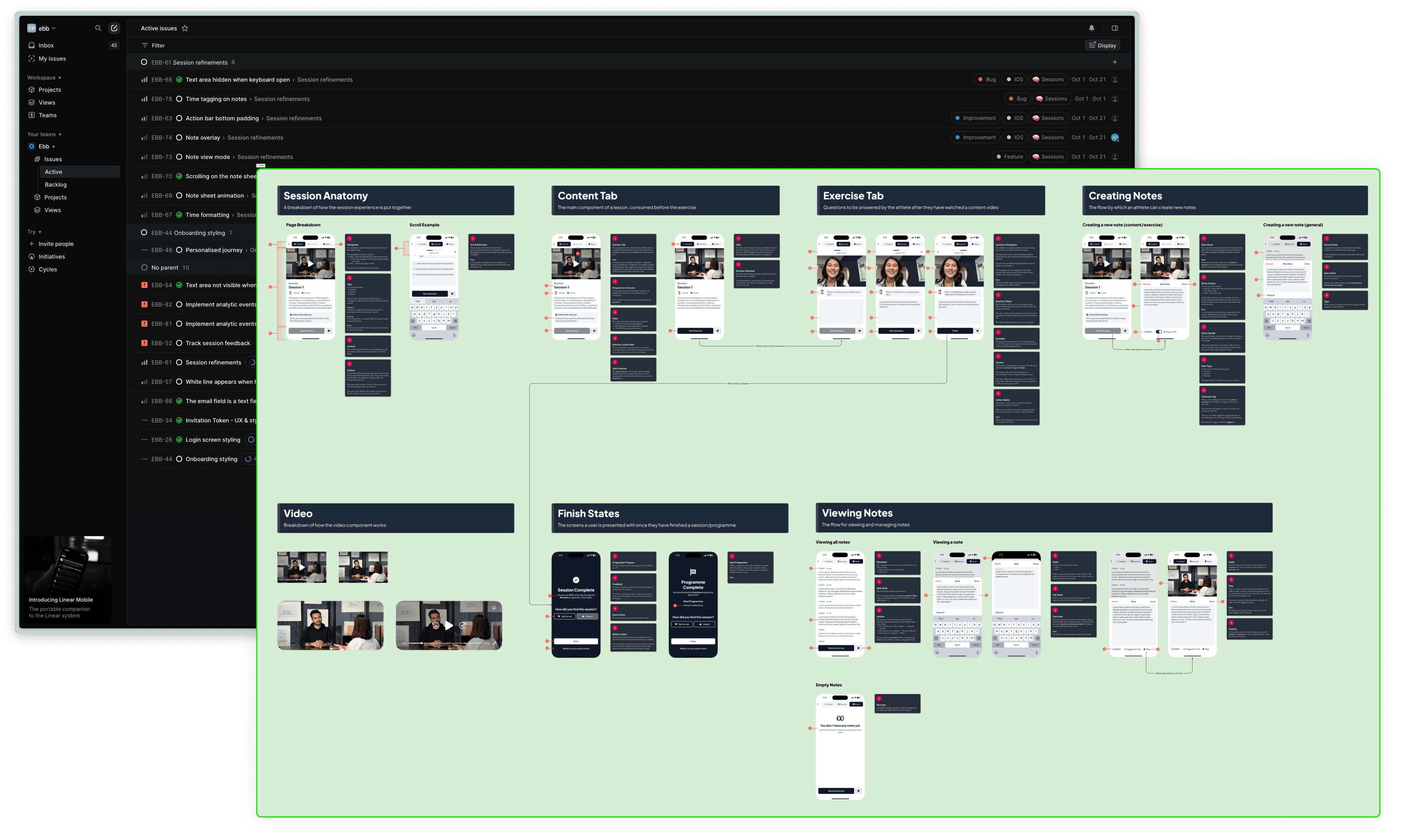
An example of a handoff board with annotations for the session experience
Streamlining Handoff & Workflow
With half of the engineering team based in a different timezone, I focused on enabling them to work as asynchronously as possible. To support this, I provided detailed annotations for each screen, ensuring the engineers had everything they needed without requiring constant back-and-forth communication. While this required an investment of my time, it was a deliberate tradeoff to ensure a smooth and efficient handoff between design and engineering.
I also introduced the team to Notion and Linear to track progress more effectively. Previously, communication had been limited to Slack, with no formal process for managing work. By using Linear, we gained much-needed visibility into the progress of tasks, improving productivity and reducing the risk of things being dropped or forgotten.
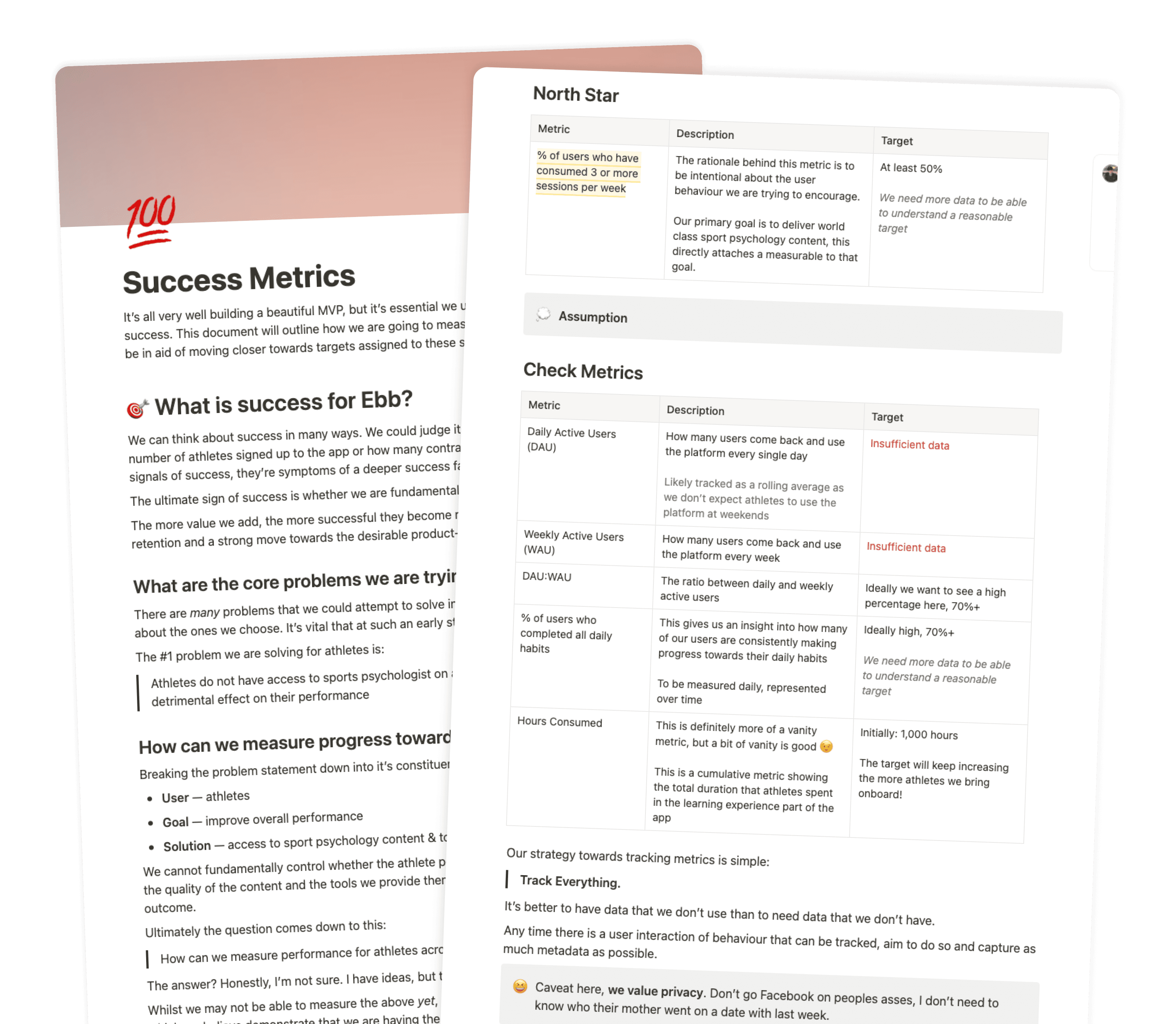
A document I crafted to define and communicate the north star & check metrics for the product
Go-To-Market
I worked closely with the CEO to develop a go-to-market plan that aligned the team around key milestones and ensured we stayed on track. We used feedback loops to gather insights from our early users and centralised the feedback in a Google Sheet.
While it’s still too early to fully measure the impact of the release, I spent time early on defining the success metrics that will help us track progress toward Ebb’s vision. The north star metric I defined was the number of athletes who consume three or more sessions per week. This will be a strong indicator of ongoing engagement and the value athletes find in the app.
In addition to the north star metric, I outlined several supporting metrics, including:
DAU/WAU/MAU to measure overall engagement
Percentage of users who completed all daily habits
Hours consumed (a more vanity-focused metric but useful to track)
In terms of qualitative feedback, athletes have responded positively to the design and usability of the app, describing it as “clear, easy to use, and beautiful.” Their most constructive feedback has focused on improving the delivery of video content, which we plan to address in upcoming iterations.
I’m actively looking for new opportunities.
Here are some of the things I care about in a role...
Flexible working
Remote friendly
Ambitious mission
Talented team
Culture first
Say hello


